Frontend/HTML & CSS
반응형 단계별로 쉽게 접근해보기
Deeb
2022. 7. 3. 23:52
css를 하다보면 반응형 만들기가 쉽지 않다. css는 넘쳐나고 어떤 부분을 반응형으로 바꿔야한 고민되는데 조금 가볍게 접근하는 방법에 대해 알아보자!
반응형으로 바꾸는 순서
1. reset빼고 @media태그 안에 전부 ctrl + c, ctrl + v한다.
- reset 관련 속성을 제외하고 /* layout */부터 footer 영역까지 반응형이 필요한 부분 다 그대로 넣는다.
2. 길이나 크기를 조절하는 요소외에 나머지 지우기
3. font나 margin등 변경되는 부분들 수정하기
Tip!
되도록 반응형을 할 때 추가 property가 없게 만든다. 그래서 처음부터 단축 속성을 미리 써두면 좋다고한다.
property value만 바꿔주면 되기때문인데 property 하나하나 쓰면 property value 자체를 추가하거나 삭제해야되기에 유지보수에 안 좋다.
예시
font-size: 13px;
font-family: 'arial';
이렇게 두 개만 작성했다가 반응형 작업하던 중 font-weight을 추가해야한다면?
처음에는 없던 property가 반응형에서만 추가된것이니 찾는 과정이 번거로워진다.
그래서 단축 속성으로 쓰는게 좋다.
font: 500 3rem "arial";
font: weight size / line-height font-family
기존 화면

태블릿 화면 & 모바일 화면

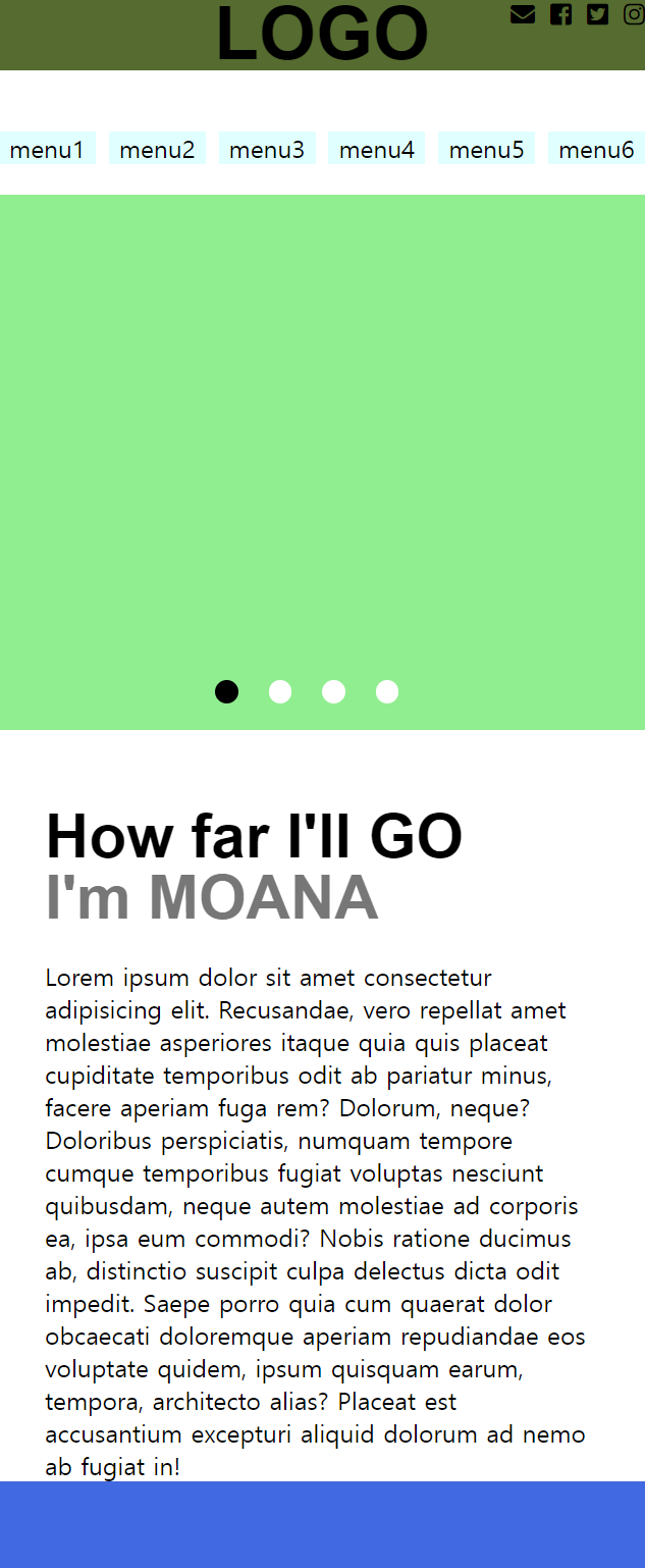
전체 영역을 감싸는 wrapper와 header 코드만 가져와서 보자.
/* layout */
.wrapper {
  width:960px; position:relative; margin:20px auto;
  }
.cfix::after {display:block; content:''; clear:both};
#header section {margin-bottom:0px;}
section {margin-bottom:40px;}

/* header */
#header section>h1 {
  font:bold 3rem/1 "arial";
  text-align:center;
  background:yellow;
}

#header section>.sns {
  position:absolute; right:0px; top:0px;
}

#header section>.sns>li {
  float:left; margin-right:10px;
}
#header section>.sns>li:last-child {
  margin-right:0px;
}


#header .nav>li {
  float:left;
  width:15%;
  background:lightseagreen;
  margin-right:2%;
  text-align:center;
}
#header .nav>li:last-child {
  margin-right:0%;
}
태블릿 화면
@media screen and (max-width:960px) {

    /* layout */
    .wrapper {width: 100%; margin:0px auto 20px; }

    /* header */
    #header section>h1 {
      font:bold 3rem/1 "arial";
      background:lightcoral;
    }

    #header .nav>li {
      background:lightcyan;
    }
}
wrapper
- postion을 지워준 뒤에 width의 값을 바꿔준다.
header
- text-align은 지우고 여기서는 색상의 변화를 위해 background의 값을 바꿨다.
- 여기서 font가 따로 쓰는것이 아니라 단축속성을 사용하였기에 수정할 때 유용하다.
모바일 화면
@media screen and (max-width:460px){

  /* header */
  #header section>h1 {
    background:darkolivegreen;
  }

  #header .nav>li {
    background:lightcyan;
    display: none;
  }
}
동기 비지님의 도움을 받아 작성한 내용입니다.
반응형